Category Archives: Design

The beauty in the building

This week there was a media frenzy around the ugliest towns in the UK after
results of a recent survey asking people which towns really deserved
the title was released.

Here is the top 10:
1 – Hemel Hempstead
2 – Luton
3 – Slough
4 – Bracknell
5 – Birmingham
6 – Camberley
7 – Coventry
8 – Cumbernauld
9 – Hatfield
10 – Gateshead

Our agency is based in a town that also doesn’t always get a great wrap for its aesthetics, but we’re proud that Northampton didn’t make the list. There are of course some beautifully designed buildings in our town, although take a look at the list above, surely these towns have some beautifully thought out design to them?

The new Birmingham Library, a landmark across the city that throws the rule book out when thinking about conventional libraries, a place to read and write, this one inspires too.

Gateshead is home to the Sage music centre, built with its iconic arched roof to create the best acoustics, and outside, a reflective beautifully modern finish standing proud on the banks of the Tyne.

Coventry, a city famous for rising like a Phoenix, with its modern Cathedral designed in the 1950’s after the previous church was reduced to just an outer shell after the devastation of WWII. The modern Cathedral has influences reflecting the local community, rich tapestries from France and art forming fonts carved from stone. The Cathedral stands tall as a symbol of resilience and gets the balance of grandeur but graceful just right.

Finally, just down the road from our offices, a now museum, the house once designed by and for Rennie Mackintosh stands. Mackintosh famous for his water colours and art and craft designs during the Art Nouveau period, has his striking style right down to the number above the door showcased in this house, number 78.

Perhaps there is something beautiful in even the ugliest of towns.
Google – Putting email in its place

Logged into Gmail this week and noticed a difference? I was confused at first with Google’s new tabular addition, being told what category my email should fit into.

The first of the three new tabs is ‘Primary’. A tab to house all the so called important stuff, the emails from friends and family, or important reminders. Google has put all my emails from people with names such as John and Sarah into this folder. From a consumer point of view this is pretty nifty, presenting to me emails that are actually the ones I want to read over promotions or social. I can easily scan them without sifting through all the promotions or notifications like @GavinwillisCM has just followed you.

The second tab is ‘Promotions’. Google is marketing this as a move to help you organise your mail and have a place for email you really really want to read, my main issue with this tab is that with half of the promotional emails I get I have opted into and want to receive. I’m not sure I want Google to tell me that all branded emails are not important to me.

The third tab is ‘Social’ one of the really valuable functions of this tool, it sifts out the standard social notifications. I did notice a few of my personal inbox had slipped through the net, mainly a conversation between my self and a friend who used the word social in the subject line!

An upside for the user though is you can add a further two tabs to your filing system and create rules and anything that helps a user organise their inbox is great, it also means Google doesn’t have full dictatorship over how you should use your email account. The downside for marketers is that we are faced with another hurdle to get over, not only do we now need to get into the inbox, we have to make sure the user sees us in the appropriate folder. The final downside is that the folders do remain hidden on mobile devices, I’m still working though my pain on this. Take a look at Google’s video below to find out more about using and utilising your new Google inbox.

Let us know what you think of the new layout, tweet us @GavinWillisCM


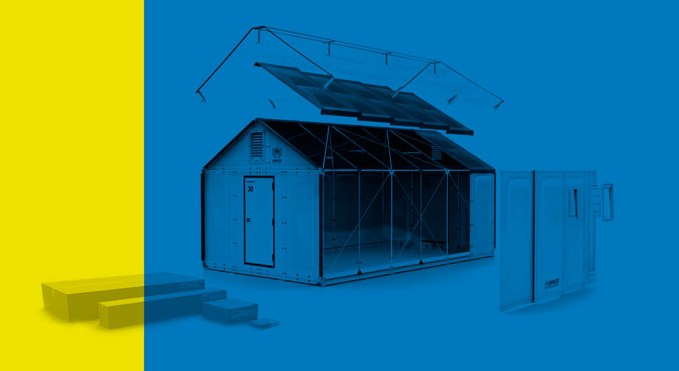
Ikea Designs Flat-Pack Temporary Refugee Housing

refugee

No longer content with selling us cheap side tables and filling our stomachs with meatballs of a questionable origin, Swedish furniture giant Ikea has taken on it’s biggest social project yet.

Ikea started in this new direction last year after the Olympics when they put forward plans for a ‘flat pack village’ to be erected next door to the Olympic Village in Statford. They then cemented their new, forward thinking, position when they later last year announced that they’d be entering the world of hospitality with the construction of a budget, capsule hotel that promises to offer, “contemporary stylish design, approachable service and, most importantly, an affordable price”, all over Europe. This new venture though is potentially the most ambitious yet, they’re attempting to tackle the issue of refugee housing in camps all across the developing world.

“Our tents have not evolved very much over the years,” says Olivier Delarue, from the UN Refugee Agency (UNHCR). “They still rely on canvas, ropes and poles – and they usually only last for around six months due to harsh climate conditions.”

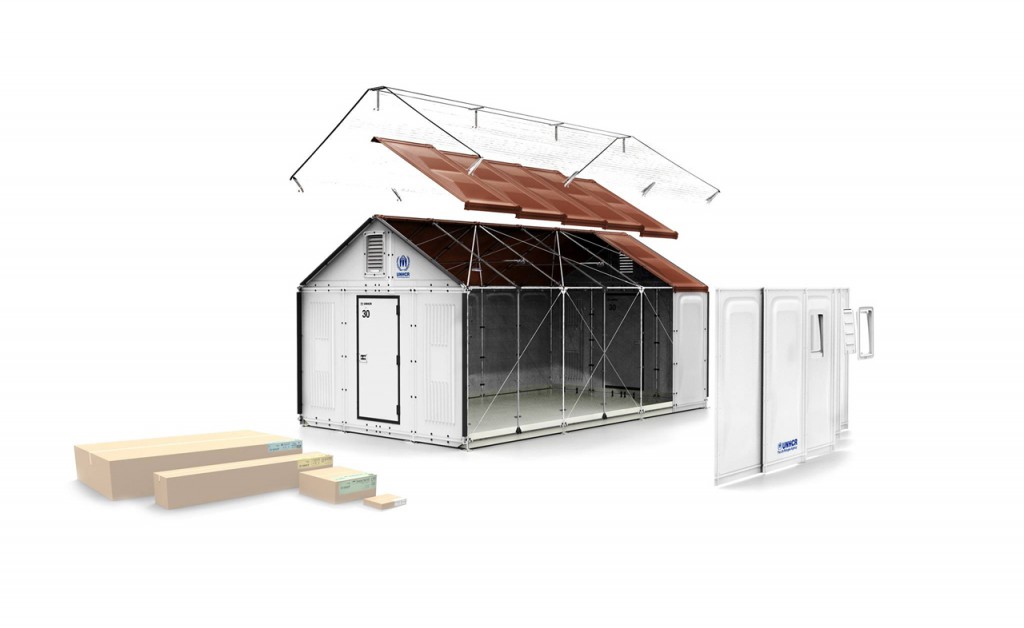
The design is somewhere between a giant garden shed and a military style, khaki canvas marquee. It’s made up of light, laminated panels that clip on a simple frame to provide UV protection through the day, and thermal insulation through the night. Also, with their hard panel side, the structures should provide a lot more privacy than previous housing method have and a solar panel on the roof gives the occupants enough electricity to power lights and a few amenities, such as a fridge or radio.

ml_ikea_foundation_house_01_1280

At present, the IKEA shelter is being tested in camps in Lebanon and Iraq. Although they’re more expensive to buy than the current tent systems used, they’re expected to last 6 times as long.

IKEA is currently the single largest private donor to the United Nations Refugee Agency.